ässä.ch


Anschauen, aber nicht anfassen
Read in english
Apart from the already mentioned workshop about smartphone apps, this semester I also visited another class called Web Engineering. Contentwise there was nothing new for me. It was basically a little bit more elaborate introduction to HTML, CSS, JavaScript (jQuery) and PHP (Wordpress Plugins). Since I know these topics quite well, going to class was unnecessary and I spent all time working on a project. The interesting part about this class was that we could work on a self-chosen project, which accounted for half of the grade. AngularJS, a JavaScript Framework I already used last semester, made such a good impression on me, that I will be using it again, but this time for ambitious project.
Idea
Actually, I had the original idea for this project half a year before. Back then I started to collect information about products, which I bought from the local grocery stores. I set up a simple MySQL Table and entered all the Information manually. This included: the name, the quantity, the price, the store, the brand, all the nutrition facts and a complete list of all ingredients. Entering all this information, especially the ingredients, was a pain, but the initial motivation sufficed to let the database accumulate about 150 entries. Enough to start the project.
Herewith, the foundation of the project was laid and I sent the project description to the teacher. I wanted to create a website that delivers detailed information about groceries to the user. So, groceries can easily be compared between different grocery stores. This can be done even before one has to decide where to go shopping today.
Website
Because the project was graded, I probably overdid adding gimmicks. The homepage serves a Pinterest-inspired overview of all products in the database. When using the also available infinite scrolling the available 150 entries are being copied over and over again to make the illusion of infinity perfect.
Concept
Somehow it had to be possible to reconcile all of the differently named and packaged groceries which represent the same things for the consumers.
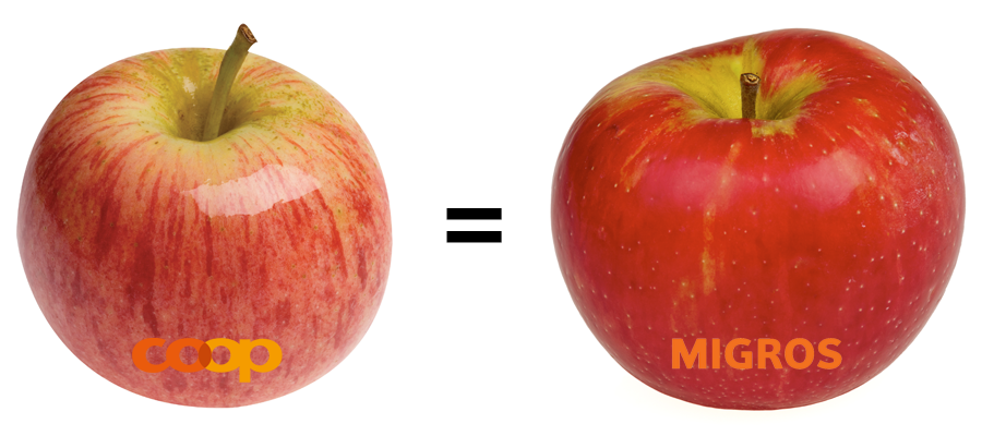
Here I had the idea of Abstract Groceries. These carry the names which we use in everyday language. If a brand name has already been established in everyday usage, then this name can be used as well. When adding a product one can choose an existing Abstract Product or create a new one.
Because most people don't like browsing through a list of named groceries and to make the Abstract Product more animate, I drew an icon for each Abstract Product currently in the database. How to design good icons was something I learned in the second semester in a class called Designtheory. I focused on simple and plain-colored illustrations with thick lines. This allows the icons to be recognized even when they are only small.

For more orderliness Abstract Products can be assigned to an assortment of categories. These categories will also hold true for each concrete product.
Usability
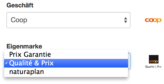
The input of products should be as easy as possible. That's why I built in some custom-made input elements. When choosing a store, a thumbnail is displayed right after choosing the store and now one can also choose the store brand according to the store selected. This makes sure no wrong store brands are chosen and it's not necessary to look for the right one in a long list.
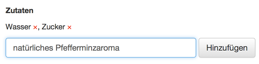
Also important is the input of ingredients. These are being entered one by one and listed overhead. If one recognizes a typo the last entry can easily be copied for reentry and deleted.
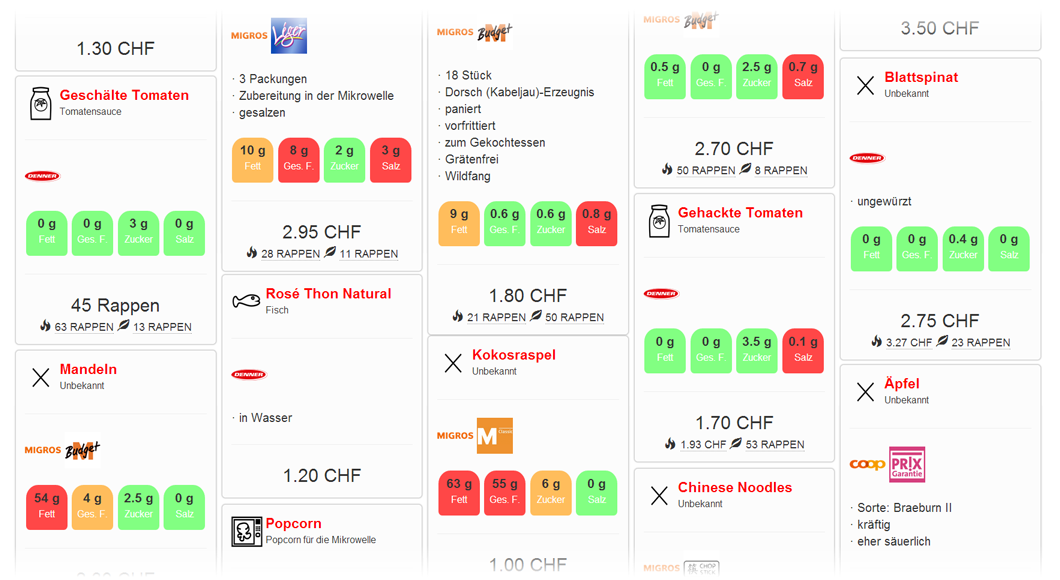
Informationvisualization
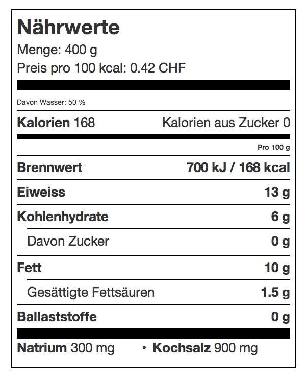
A product display should be as informative as possible. Diagrams open up the possibility to quickly get an overview of the most important key figures. Where possible the data on display is tailored to the characteristics of the user. Essentially there are four types of diagrams available. The first isn't really a true diagram, it's the textual representation of the nutrition facts, in the form commonly seen in the United States. I have used this representation, because it's clearly normed, what cannot be said about all the different representations found on Swiss products.
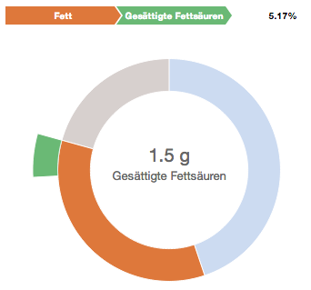
The above representation is not the default. As a starting point I have chosen a simple donut chart showing the nutrition facts and their relationship to one another by weight. When hovering over the diagram some more details are displayed. Also on an outer ring the subcategories and their relationship is explained. For example how much sugar the carbohydrates contain.
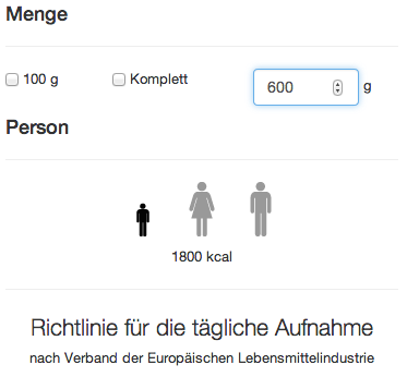
Now a more elaborate and complex chart follows. It builds on the foundation of the first one, but can be adjusted to the needs of the user and the quantity he or she wants. To get the best result the user first has to choose the Guideline Daily Amount, which is accomplished by saying wheter you are a woman, man or a child. After that you quickly choose the quantity, which by default is the whole package. In the inner ring the chart shows how much your GDA is and on the outher side how much of this is covered by the product considered.
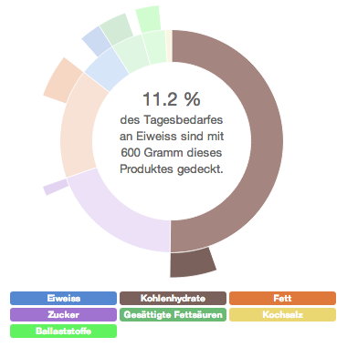
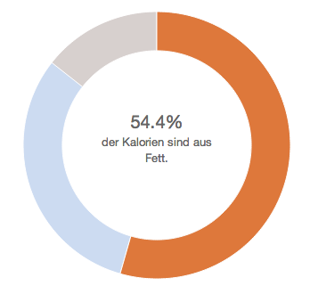
Finally there is a less complex chart which resembles the first, but shows where the calories come from.
August 31, 2014

December 20, 2014
December 15, 2014

August 18, 2014

March 9, 2014

March 1, 2014